Developing a brand identity and product label
Client:
Kevin Daly Architects | Three Mile Honey
Industry:
Honey | Food products | Retail | E-commerce
Role:
Visual designer | Creative director
Collaborators:
Kevin Daly | Courtney Gibbs
Output:
Competitive analysis | Client branding exercises | Moodboard | Logo | Brand identity | Honey jar label | Product mockups
Tools:
Figma | Illustrator | Photoshop | Capture | Procreate

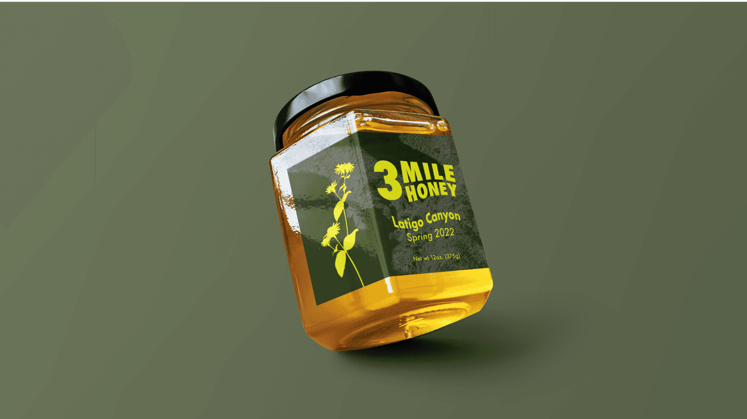
Product label mockup
Context:
Architect Kevin Daly has an apiary at his Crenshaw studio. His passion for beekeeping led him to also establish hives at his residence in Latigo Canyon, Malibu.
With an abundance of honey he plans to offer his honey as seasonal gifts to clients, and sell it in local grocers.
This project's primary objective is to establish a unique and memorable honey brand that resonates with consumers seeking high-quality, locally produced goods.
Create a unique brand identity and design an attractive product label for a niche honey brand.
Honey brand name and tone:
Honey Vibe Meter Exercise
The honey vibe meter exercise was devised as a collaborative exploration to define the emotional and sensory attributes associated with the brand.
This exercise helped uncover the unique essence and characteristics that the brand should convey. By categorizing descriptors on a spectrum, the exercise provided a visual representation of the desired brand personality. The spectrum served as a guide for design decisions.
Naming Brainstorm and Categorization Exercises
The naming brainstorm exercise was a creative session in which a wide range of potential names for the honey brand were generated. The goal was to capture the essence of the brand, its architectural inspiration, and the natural purity of honey.
Subsequently, the categorization exercise involved organizing the generated names into thematic groups based on shared characteristics or meanings. Through categorization we could identify overarching themes and concepts that resonated with the brand identity.
A structured assessment of the naming options guaranteed that the final selection would effectively capture the desired characteristics and messaging.
Early logo exploration:

I explored logo designs for alternate name options early in the project

Exploring the 3 Mile Honey logo
Label iteration and refinement:
I presented the clients with 4 different conceptual directions. The chosen concept centered on simplicity, featuring yellow silhouettes of canyon sunflowers against a green background, accompanied by black text explaining the three-mile story.
A request was made to incorporate a topographical element to represent the landscape the bees traverse. The second iteration introduced a beige and khaki topographical map background, rearranged flowers on two panels framing the logo, and distributed the story text across the label's outer panels. The logo was enhanced for added impact.
Responding to a desire for a photographic background of Malibu Canyon, the third iteration incorporated this change. However, a printer's requirement for monochromatic printing altered the direction, leading to a revision that transformed the landscape image into a monotone representation.
This phase revealed a subtle 70s surf vibe emerging from the colors, which resonated with the Malibu location, resulting in a logo update to reflect this groovy sentiment. The iterations showcased the adaptability of the design process and the dynamic nature of visual exploration in response to feedback and practical considerations.
Label design iterations
Round 1
Round 2
Round 3
Round 4, V1
Round 4, V2
Final thoughts:
Using an iterative approach means I can adapt to changing needs, resulting in design improvements that made both the appearance and functionality better.


