Creating an instructional resource for tablet, mobile and print
Client:
Devin Winter Label
Industry:
Knitwear | Education | Slow fashion | E-commerce
Role:
UX designer | UI designer | Visual designer | UX writer
Output:
User interviews | User persona | Wireframes | Mood board | Style guide
Tools:
Figma

Context:
Sometimes I design and sell knitwear that I make on a flat bed knitting machine. Since starting this hobby I've developed a knitwear design process that is simple and replicable.
I know of people who like to make clothing and would like to try making knits, however they don't know how to get started. The existing instructional resources available are complex and outdated and difficult to find. They could become frustrated with the tutorial resources available and give up.
Creating a "How to design a sweater to make on a flat-bed knitting machine" guide would help this group of people over the learning curve that knitwear design presents.
Develop an instructional resource that outlines basic principles and comprehensive steps for designing a sweater to make on a flat-bed knitting machine.
Principles:
Step-by-Step Approach
Organize content into clear, sequential steps that guide users through the sweater design process. Each step should build upon the previous one, fostering a sense of progression and accomplishment.
Cognitive Load
The guide's content should be structured in a way that minimizes cognitive load, avoiding overwhelming users with too much information. Complex concepts should be broken down into manageable chunks.
Visual Guidance
Utilize diagrams and images demonstrate key concepts and techniques. Visual aids should enhance comprehension and serve as a universal language for learners.
Modularity
Present the guide's content in a modular fashion, allowing users to navigate easily between sections and choose their learning path based on their needs and interests.
Consistency
Maintain consistent visual and design elements throughout the guide to create a unified and recognizable brand identity.
Scope:
Develop and design an instructional resource that outlines essential principles and comprehensive steps for designing knitwear on a flat-bed knitting machine.
Organize the content in a user-friendly manner, facilitating a step-by-step learning approach. Employ visual aids such as diagrams and images to enhance comprehension.
Modularity will enable users to navigate through sections according to their needs. Maintain a consistent visual identity, reflecting the creator's brand.
With this instructional resource I hope to empower users to overcome the challenges of the knitwear design learning curve and embark on a fulfilling creative journey.
User interviews and behavior evaluation:
I conducted user interviews two members of the target audience. These interviews provided insights into the daily routines, motivations and preferences of the user and uncovered potential challenges related to consuming instructional content.
Both users engaged with online platforms and videos to access tutorial content. They highlighted the importance of easily consumable content. Key findings included the need for clear visuals, concise instructions, structured guidance with room for creativity, and insights about documentation of the design process.
Annie Jingle was created to represent the wants and needs of the target audience, synthesized from user interview responses.
Key findings:
- Unsatisfactory existing resourcesExisting resources suffer from problems such as outdated formats, hard to find books, lengthy blog posts, and video tutorials with too much irrelevant content. Users find the existing resources frustrating to use.
- Diverse Learning StylesUsers exhibit varying skill levels and learning preferences, engaging with videos, online platforms, written content and learning through trial and error.
- Clear VisualsUsers appreciate example images and labeled diagrams that clearly demonstrate an idea or concept.
- Creativity vs StructureUsers value creative exploration but seek structured guidance.
- Analog and Digital PreferencesUsers value both analog and digital resources. They appreciate the tangible nature of hard-copy materials, but also rely on digital platforms for quick access and consumption. They often access tutorial materials on phone screens since they are working in studio spaces, not their offices.
- Design Documentation for repeatable processesUsers struggle to document design decisions, leading to abandoned projects because they can't remember the steps they need to repeat. Users desire guidance for documenting relevant information.
Potential challenges:
Balancing Creativity and Structure
Finding the right balance between providing clear steps and leaving room for personalization could require careful consideration.
Catering to Diverse Learning Styles
Designing instructional approaches that cater to different styles is important. Ensuring that copy, visual aids, and diagrams are clear, well-labeled, and easy to follow is essential.
Conveying Complex Techniques
Knitwear design involves intricate techniques that might be difficult to explain concisely.
Print and Mobile Harmony
Optimizing for mobile and for print requires careful consideration of structure and layout.
Encouraging Documentation
Motivating users to document their design journey might be challenging.
Accommodating analog and digital preferences:
My design process began by testing how the resource could accommodate all potential use-cases as a static asset.
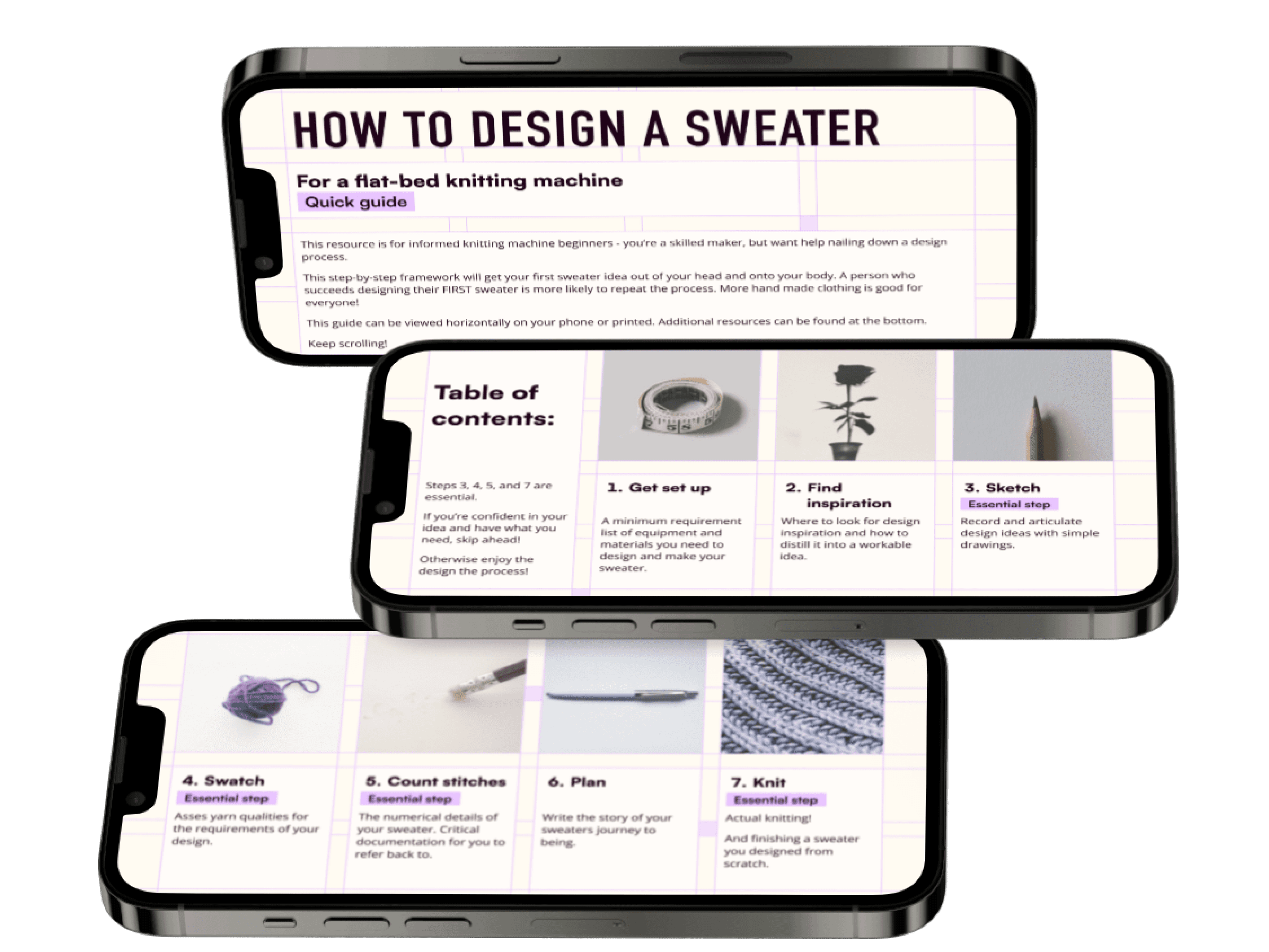
The primary mode of access to the resource would likely to be by mobile phone. By opting for a horizontal orientation more content can be displayed within a section as users scroll down the resource. The height of a sheet of paper comfortably accommodates three horizontal mobile screens. This insight guided the overarching formatting principles for the project.
Early in the process, I conceived a visual design idea involving the use of a grid pattern. This concept drew inspiration from knitting grid paper and a specific Wassily Chair poster.
To ensure a cohesive visual design, I aimed to establish the grid before integrating content.
After several tests, iterations, and adjustments for speaker notches, I arrived at an appropriate solution. This solution provides the desired design modularity while retaining the intended visual element.
Formatting for mobile and print:
The proportional relationship of an A4 sized sheet of paper and iPhone 14 screens.
Devising the grid:
The grid has margins to accommodate phone speaker notches.
Creating modular sections for content:
A modular system for arranging text and image content within any given horizontal mobile section gave me layout flexibility within the constraints of the grid.
Iterations of content structure within horizontal mobile sections.
Creating and incorporating content:
The heart of the "how-to" guide lies in the content, curated and strategically integrated.
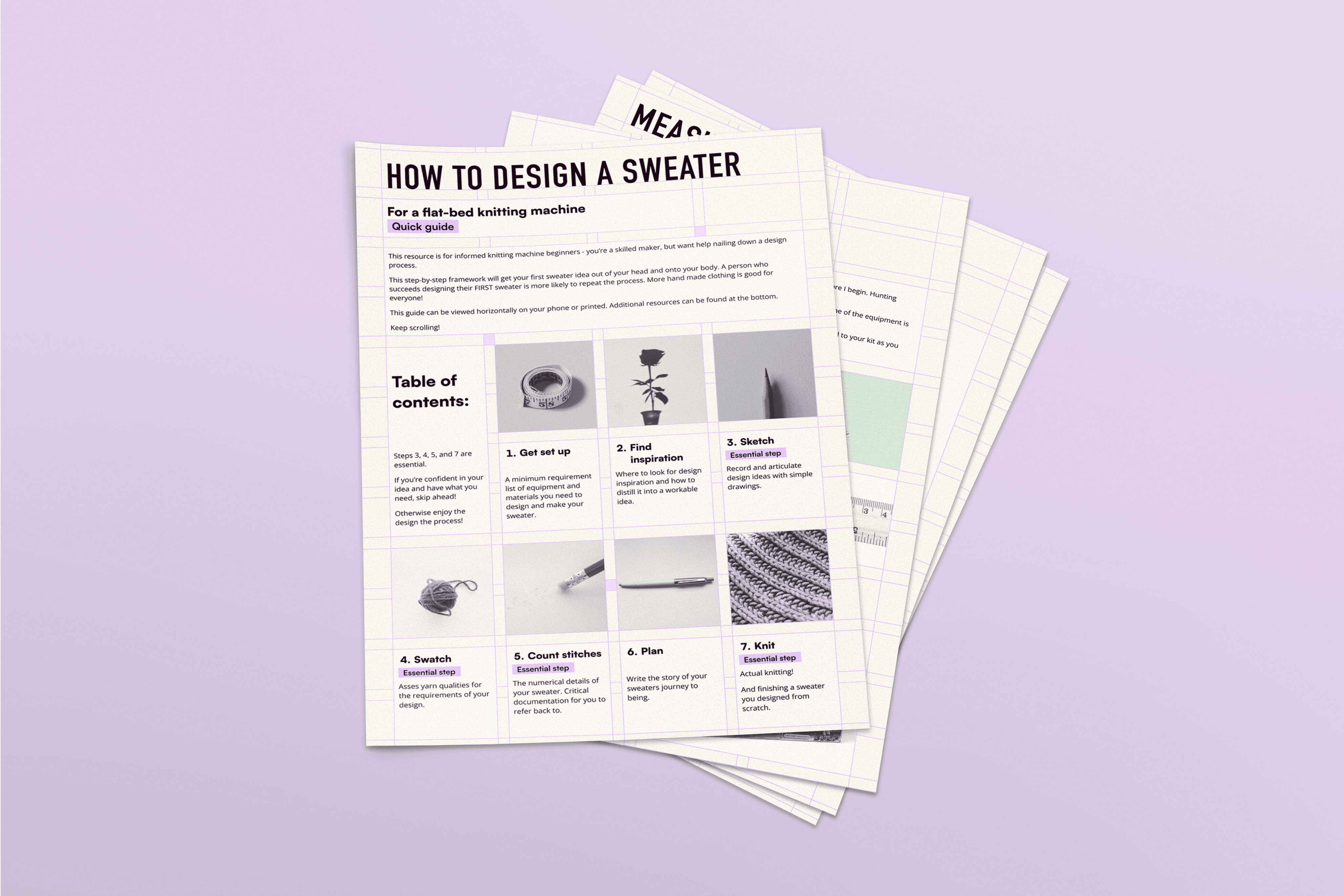
A well-structured table of contents details the overarching process and gives users the opportunity to skip ahead if they desire. Each printable page is a single step in the design process, numbered and labeled for easy finding.
Each step is broken down into essential tasks and each task is explained. The guide maintains a sequential flow, accompanied by images that reinforce key concepts and provide visual aids when needed.
The instructional language used in the guide is purposefully approachable, ensuring that users can comprehend the instructions without grappling with technical jargon.
The content was informed by the insights gained from the user research phase. It directly addressed the frustrations and challenges expressed by users, such as the need for concise instructions, clear visuals, and a balanced approach between creative expression and structured guidance. The design is tailored to address these needs and further enhances the user experience by providing solutions that distinctly cater to the identified pain points. For instance, by highlighting essential steps, users with higher proficiency levels are able to navigate directly to the sections that are relevant to their unique process.
Wireframes
From a rudimentary content inventory I devised step-by-step instructions, simultaneously building wireframes to test content layout.
Visual design:
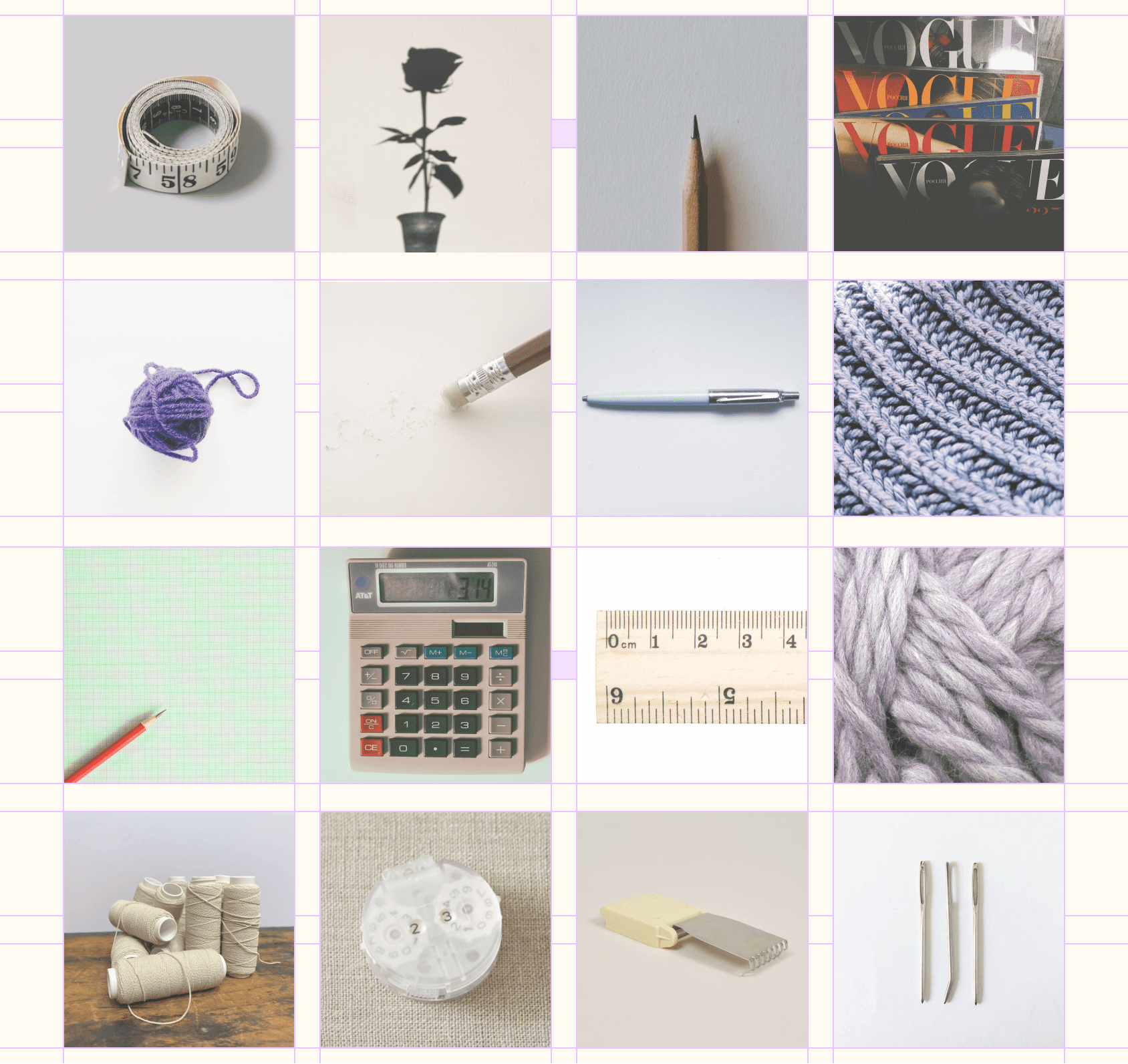
The visual elements align with the aesthetic of the mood board. Subtle overlays were applied to the stock images, resulting in a harmonized appearance that contributes to the overall visual cohesiveness of the guide.
Mood board
The mood board established an aesthetic direction for the guide.
Image treatment:

Stock photography in the grid layout with unifying overlay.
Designing suplemental worksheets:
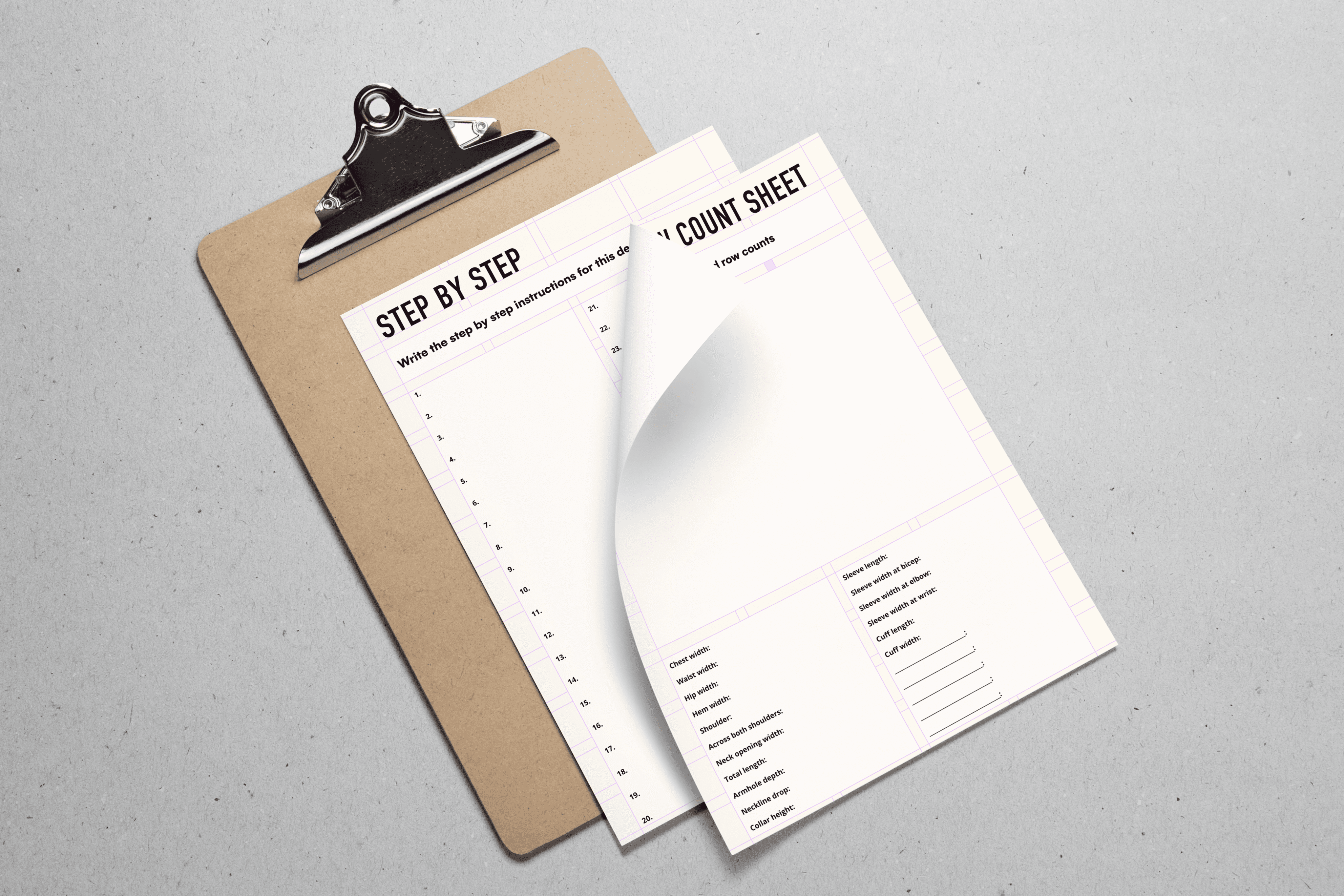
Recognizing the challenge users faced in documenting their design decisions, worksheets were introduced to the guide.
These printable templates served as a valuable tool, encouraging users to record critical information during their design process.
By including these worksheets, the guide not only provided instructions but also facilitated users' active engagement, allowing them to create a personalized and repeatable design process.

The final design:
Incorporating user feedback and insights throughout the design process ensured that the final guide was tailored to meet the preferences and learning styles of the target audience.
An iterative methodology allowed for continuous improvement.
Effective use of diagrams and images as visual aids proved to be instrumental in enhancing user comprehension.
Designing for mobile access and offering printable resources ensured that users could engage with the guide in their preferred context, underscoring the importance of accommodating various user preferences.

The "how-to" guide, printed for IRL interactions.
Click through to view the entire guide
Prototype
Scrolling through the guide on mobile
Final thoughts:
In the future I hope to revisit this project and rethink how users access this resource.
I would consider bringing it into an app and expanding on the functionality. There could be options to upload and catalogue designs, to record and save measurements.
I wouldn't give myself visual design requirements before the content had been planned as I think the layout constraints that I set for myself at the start of this project limited the design unnecessarily.
Proto-
type


